Wednesday, March 23, 2011

Rafael Vinoly Architects - UCSF Stem Cell Building

Seen here at Designboom
all images courtesy rafael vinoly architects
photographer: bruce damonte


The university of california's 'ray and dagmar dolby regeneration medicine building' designed by world-renowned firm rafael vinoly architects has celebrated its official opening. Located on a sloping urban hillside in san francisco, the continuous structure navigates the uneven site, responding with a serpentine form that is supported by a system of steel space trusses.


Hugging the curve of the topography and pre-existing site conditions, the building rests lofted on an organization of steel supports which branch out from concrete piers, minimizing excavation as well as incorporating seismic base isolation. the single-stretch structure accommodates one continuous laboratory on its main floor which steps down a half-storey to create four split-level areas. each level features an office cluster and a green roof with wildflowers and plants. A system of exterior ramps and stairs provide circulation between floors while an elevated pedestrian bridge connects the building to three nearby research facilities and UCSF medical center.


The transitional space between the split levels become a hub for activities, featuring break rooms and common areas for an open interface for communication and a cross-pollination of ideas. Largely outfitted with interior glazing, the laboratories further promote collaboration with an open-floor plan and a flexible casework system that can be quickly reconfigured to accommodate the programs' needs.


Saturday, March 12, 2011

Somnium Mattresses now at DZINE


DZINE is proud to now represent the mattress manufacturer Somnium.  What sets Somnium apart from their competitors is their OmniFlex springs, designed to increase comfort through better support.


Being the most advanced spring mattress available today, it relies on more than a century of experience in mattress making, European design and the latest medical and ergonomic research.  Plus it offers much more than you come to expect from your bed! 


For the healthiest and most relaxing sleep posture, your shoulder and hip should be allowed to sink into your mattress more deeply than the rest of your body.  This is a design challenge Somnium has met head on by pioneering the use of two different firmness grades of springs within the same mattress, offering optimum support and comfort.  The hourglass-shaped springs are made from the same high-quality elastomer traditionally used in the aviation and car industries and high-performance athletic gear.  These innovative springs offer structural strength and exceptional durability that is superior to that of metal springs.


The OmniFlex spring is guaranteed to prevent motion transfer, even while sleeping next to a restless partner.  So stop by DZINE today and test out our Somnium mattress! These mattresses are made in the USA and can be delivered in one to two weeks.  Custom sizes are available.

Friday, February 25, 2011

Check out the Latest Additions to our Showroom!

DZINE is pleased to announce the arrival of some of the latest designs introduced at the 2010 Salone del Mobile in Milan.

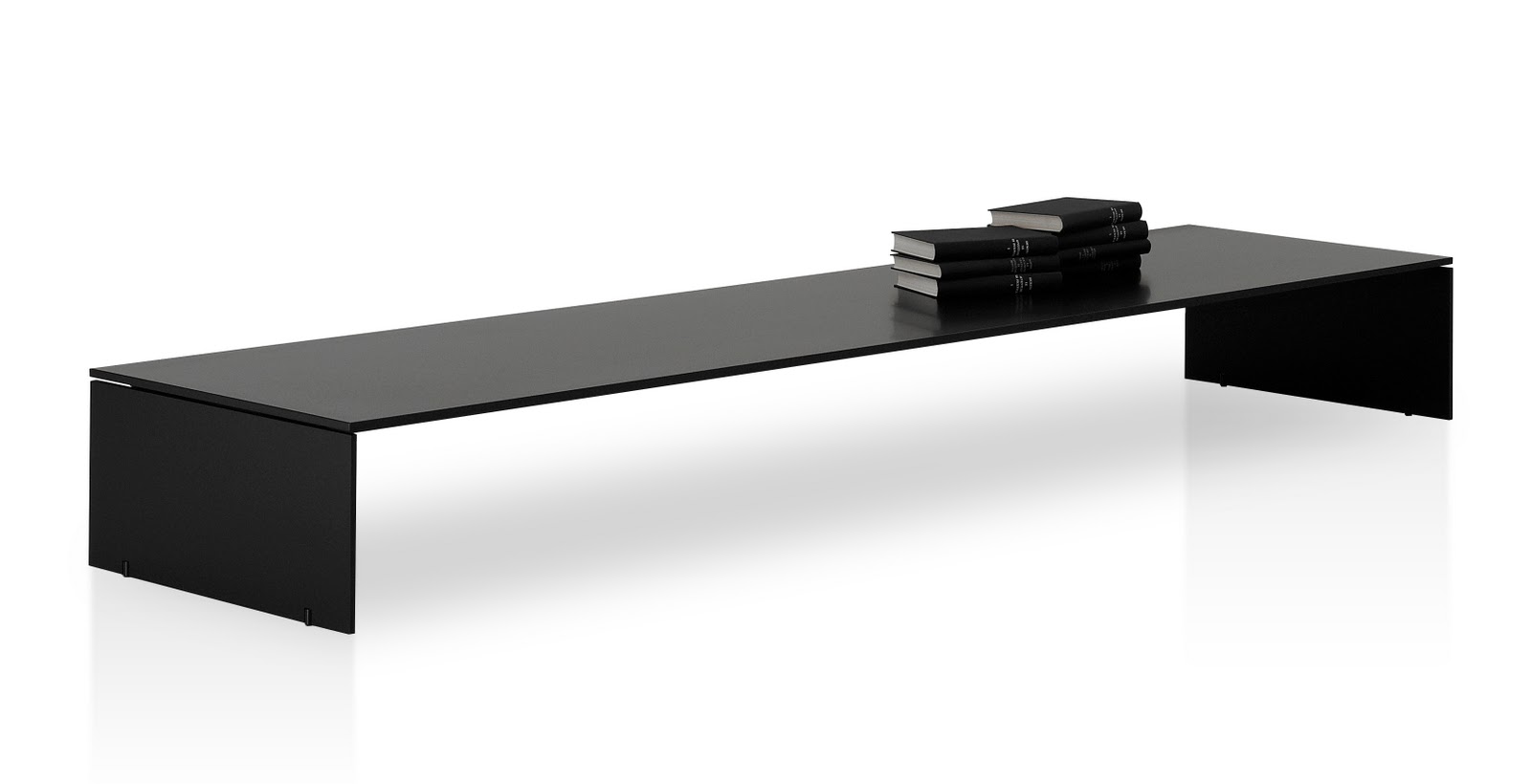
Porro added several new items to their collection. New from Piero Lissoni are the ‘Neve’ chair in wood and ‘Modern Light’ coffee table. The 'Jade' armchair, with coordinating side table, 'Shahan', designed by Christophe Pillet, and the 'Balancing Boxes' side table designed by Front.

The ‘Load It’ wall shelving system, designed by Wolfgang Tolk, has new life with the latest addition of mirror and steel finishes for the back panels. This system features thin, steel shelves that appear to float from between the back panels. With several options for back panel sizes and shelving sizes, the ‘Load It’ can be configured in endless combinations.


Neve chairs


Modern Light coffee table


Jade armchair and Shahan side table


Balancing Boxes side table

Our new Load It unit

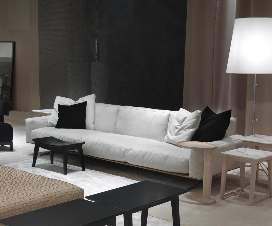
Antonio Citterio, the art director of Flexform, presented the new ‘Soft Dream’ sofa collection at last year’s Salone del Mobile, which is designed with slender proportions and distinctive details. The collection includes several sofa sizes, as well as sectional modules and ottomans, allowing for just the perfect configuration.


Zanotta introduced the ‘Album’ table designed by Roberto Barbieri. The Album table is made of solid Oak or Canaletto Walnut wood, brushed and finished with a natural varnish. This simple table design is elevated with the detail of 45º angled legs, connected almost seamlessly to the table top. Available in two standard sizes or custom sizes.


Feel free to stop by the showroom to see the new pieces in person!

Thursday, February 24, 2011

John Pawson - Plain Space

Text by Beatrice Galilee
Photography by Luke Hayes


I was planning to start this review with a snarky whine that the John Pawson retrospective 'Plain Space' wasn't even remotely finished for the press preview, meaning that in order to write this article I had to make the journey to the Design Museum twice in two days. However, upon returning to the completed exhibition it became apparent that there are far more serious matters to be concerned with.


Let's start with the subject matter. It's clearly not John Pawson's fault that his back catalogue is the topic of a major autumn blockbuster at the Design Museum, (although one could argue that as he has been commissioned to build the new extension it is slightly predictable). Pawson's architecture has always been an art of the barely there. His design is a slither of polished stone and shafts of light. It's chapels and art galleries, private houses and closed collections; his name is a byword for expensive taste. The way his work has been treated, however, is so void of all personality, humanity and culture it has rendered the Design Museum an institution that is entirely out of step with contemporary discourse in architecture and architecture exhibitions.

The last five years has seen a sea change in approaches to architecture curating. DomusWeb published an essay on the topic by Carson Chan last week and this autumn's issue of LOG magazine directed by Tina Di Carlo is dedicating to curating architecture. The Venice Biennale of Architecture, directed by Sejima was a manifesto in the art of space. Both MOMA and London's V&A museum have commissioned 1:1 scale buildings in an effort to eliminate the layers of representation, create a critical and compelling narrative and captivate a mainstream audience.


If anyone was looking for evidence that using photographs and scale models in architectural exhibitions was passé and pointless, the Design Museum has provided it here. The purpose of the tens of models dotted around on plinths and tables, made lovingly from card or rich hardwoods, is hard to work out. The 1:20 model achieves so little, communicating just masses and scale from a perspective that is positively obstructive to anyone trying to interpret the space. They have their place when used cleverly or selectively but essentially the model and the vocabulary used to describe them is part of an abstract language learnt in architecture schools that is inaccessible to the public. To rely on scale models for a blockbuster show is at best unimaginative and worst reductive and elitist.

However it must be said that there was a concession to 21st century curatorial thinking. In pursuit of communicating the phenomenology that makes up much of the quality of a Pawson building, a 1:1 space was constructed in the exhibition. It's a strategy being deployed by some of the most interesting architecture galleries around today. Unlike these clever and thoughtful commissions, which generally resulted in spaces with a sense of individuality, using interesting materials to create rare or special spaces, John Pawson's 1:1 space was banal and confused.


The space was a white vaulted room furnished by two long wooden benches with a panel of misty white muslin at one end and a hazy white light at the entrance. Unfortunately it didn't have any sound insulation, so the calm white space just felt like another room in the calm, white gallery but slightly noisier. There is a sense that Pawson's tasteful minimalism should somehow speak for itself, that it doesn't have to justify its position or try to be understood. There were moments of intrigue in the film and the large-scale commissioned photography (no people, of course) was nicely done, but largely the exhibition just felt dated. There were huge chunks of various materials used in the building process laid out on the floor like a specification showcase at a cladding supplier.

It's a shame because Pawson's work, crafted for so many decades, has its roots in Japan, the buildings he works on are imbued with an almost mystical quality emerging from in his own religious beliefs, his rigorous training. He has a real obsession and dedication to building that is worth investigating and revealing. It's almost impressive that the exhibition has managed to eliminate everything interesting about what he does and replace it with a generic architecture-exhibition-by-numbers.

Perhaps it's possible to see this exhibition as a genuine attempt to document the work of one of the country's best-known architects. Maybe his relentless pursuit of quality could be a manifesto and inspiration for some younger architects. Or perhaps this kind of exhibition is exactly the kind that further alienates anyone with cultural curiosity from architecture.

There are so many fascinating people working in architecture today that are challenging the concept of the architect and questioning and reformulating what architecture really is and does in society. There are architects like Junya Ishigami working with a kind of minimalism that is more relevant and more exciting than anything on display here. There are people across the world turning design on its head, but instead of seeking them out, the Design Museum seems determined to restrict itself and its visitors to the architectural history of grey haired men with expensive clients.


Found at DomusWeb

Monday, February 21, 2011

3 San Francisco Firms made the list - "Top 50 Firms" of the Residential Architect Magazine

Fougeron Architecture, David Baker + Partners Architects and Craig Steely Architecture are three architecture firms based in San Francisco featured in the "Top 50 Firms" in Architect Magazine's December 2010 issue.

Read all three firms featured articles below:

Fourgeron Architecture
by Cheryl Weber, LEED AP


“The main intent was to give the clients an atmosphere of beauty that expresses both warmth and worth and encourages their interaction,” Anne Fougeron, AIA, wrote about her design for Planned Parenthood at Eastmont Mall in San Francisco. That simple statement also could be applied to her light-box-like single-family residences, which are bold incubators for other project types, including health care and affordable housing.

High-end, low-end, private, public, and everything in between, Fougeron’s varied buildings are modern, sensual, and interesting to look at. Her own memorable kitchen, in an 1895 Victorian, has a cerulean blue ceiling, an ochre-colored cork floor, clear and sandblasted glass walls, and a soft green night-time glow emanating from gelled fluorescent strips in the adjacent bath. It’s not just look-good architecture, it also satisfies her curiosity about how layers of translucent materials interact with the changing light.

“We try to keep a diverse portfolio of work and bring the same voice of design excellence to all of it,” Fougeron says. “We’re interested in creating enlivened spaces that are about light, the expression of transparencies, and how well-crafted materials come together to reinforce those ideas.” She is currently working on Buck Creek, a cliffside house on the south coast of Big Sur, along with her first monograph, to be published by Princeton Architectural Press in 2011.

What is the most gratifying aspect of residential practice?  Using single-family homes as a lab for creative architectural ideas, and the personal relationships we form with clients.

What is the most frustrating aspect?  In the entitlement process, trying to convince people that design innovation is an essential part of a city’s growth. It’s also a struggle to be considered in the same league as firms owned by men.

What is your mission statement or firm goal?  To join the opposites of old and new, industrial and residential, rough and refined, urban and natural in modernist compositions.

What is the most indispensable tool in your office?  The people who work for me. Architecture is about collaboration, having the right team.

What software does your firm use?  AutoCAD and Vectorworks.

Who is your ideal client?  Someone who hires an architect not because they have to, but because good design is something that matters.

What is your favorite building?  Hagia Sophia in Istanbul, or Sainte-Chapelle in Paris.

If you didn’t have time to design your own house, who would you hire?  Japanese architect Kengo Kuma.
_____________________________________________________
David Baker + Partners Architects
by Meghan Drueding


Many architects design sustainable projects, but for David Baker + Partners (DB+P) the commitment to bettering the environment goes deeper. David Baker, FAIA, LEED AP, gets around San Francisco on a bike, and he and partners Kevin Wilcock, AIA, LEED AP, and Peter MacKenzie, AIA, offer their staff incentives to walk, bike, or take public transportation to work. Along with a comprehensive recycling program, the company provides a compost pile for food waste. “We really do try to incorporate sustainability into our office culture and lifestyle,” Baker says.

The firm has applied its bold, socially conscious design aesthetic to a wide range of project types, including affordable and market-rate housing, mixed-use developments, hotels, and custom homes. It often works with repeat clients, and emphasizes density, pedestrian-friendliness, sustainability, and residents’ daily quality of life. Over the past few years, DB+P has taken on some larger-scale projects that involve urban planning as well as architecture, such as Tassafaronga Village, a 7.5 acre, LEED-ND Gold community in Oakland, Calif. Wrote San Francisco Chronicle architecture critic John King in December 2009: “No local firm has a better track record than David Baker + Partners at mending the urban fabric.”

What is the most gratifying aspect of residential practice?  For us, being in the affordable housing world, you change people’s lives.

What is the most frustrating aspect?  Sometimes you’ll have a really good idea, but if it’s new, people will resist it.

What is your mission statement or firm goal?  We sort of have a firm statement, on the front page of our website. It’s not really a mission statement: “Our work combines social concern with a signature design character, resulting in distinctive, high-quality buildings that provide residents with a strong sense of community. In this way, our work acts as an advocate for improved urban planning, where looking good only counts if it does good, too.”

What is the most indispensable tool in your office?  The most indispensable piece of our practice is the culture and the people. In terms of an actual tool, the 3D digital building models make a huge difference. It’s a totally different way to design.

What software does your firm use?  We use Revit.

Who is your ideal client?  The ideal client is one who’s a nice person, and who’s involved without being oppressive about it. We really like intense client involvement. If they have an idea, we can respond to it. When you work with clients a long time, you develop a level of mutual trust that makes the process a lot of fun.

What is your favorite building?  I can’t say I have a favorite building. I have a lot of buildings that I like a whole bunch.

If you didn’t have the time to design your own house, who would you hire?  I can’t imagine having someone else do it. I’ve built several houses for myself and I just really enjoy it. You can do those things you’re worried about trying on someone else.

________________________________________________________
Craig Steely Architecture
by Nigel F. Maynard


It’s hard to stand out from the large collection of exceptional firms practicing in California, but Craig Steely has made a name for himself with finely detailed custom homes and apartment renovations recognized for their architectural rigor. “We’re focused on design,” Steely says. “And we like working with people who think less is more.”

Indeed, the firm is known for crisp, clean lines and for work with “formal elegance in the classic modernist tradition.” But it’s not all about design. Along the way, Steely has built a reputation as a problem-solver—handy for his efforts in both San Francisco and Hawaii.. “We’ve somehow developed a reputation as the one to call if you have a difficult lot but you want something special that fits,” he says.

The firm has remained small and chooses projects with a discerning eye. Although most of the commissions are for custom homes and interiors, Steely is not opposed to other types of work. “We wouldn’t mind a small big project,” such as a small museum or cultural center. “The type of projects that Rick Joy gets,” Steely jokes. “We’re looking for something with the details and proportions that a house has.”

What is the most gratifying aspect of residential practice?  My favorite clients become my friends.

What is the most frustrating aspect?  None that I can think of.

What is your mission statement or firm goal?  One strong idea.

What is the most indispensable tool in your office?  Flexibility.

What software does your firm use?  Rhino, AutoCAD, HB pencil.

Who is your ideal client?  Someone complex enough to want a simple house.

What is your favorite building?  Casa Malaparte

If you didn’t have the time to design your own house, who would you hire?  A Chilean—Smiljan Radic or Mathias Klotz.

Saturday, February 19, 2011

Kuramata, Sottsass: The Importance of Dreams and Love

A design report from Tokyo by Salvator-John A. Liotta


Both core figures in the modern history of design, Shiro Kuramata (1934-1991) and Ettore Sottsass (1917-2007) were searching for a design that would bring joy and a sense of surprise to life via different means of expression, unmindful of the functions and utility we believe objects should contain. With this exhibition, its curator Yasuko Seki and the museum's director Issey Miyake asks us to rethink the very meaning of the word "design". They are anxious to stress it is not a retrospective: not everything is easily classified and the deliberate focus is on a "non-period". For Seki and Miyake, the main aim of this exhibition – already planned before 21_21 Design Sight opened in 2007– was to convey the importance of dreams and love in design. The message is directed mainly at the new generations, unfamiliar with Kuramata and Sottsass's work.


The current times we are living in are very different from those when these two masters of design were to the fore. The 1980s, in particular, when Kuramata and Sottsass cultivated their friendship, was a golden age for Japan, which aspired to being the number one nation in the world. A time when the economic miracle of the Rising Sun prompted people to take an interest in the quality of life and in design. Thirty years on, the widespread use of information technology and the Internet as too the lesson taught by globalisation are making us wonder "What is design?"once again.


The exhibition uses design objects, period film-clips, slide shows and a number of quotations to show the greatness of these two designers, who never pursued success or riches. On the contrary, the very words irritated them. When presenting the exhibition, Barbara Radice-Sottsass said that the two designers should, perhaps, be seen as two modern witchdoctors who wanted to use design to cure the world; two poets who happened to be designers.


Kuramata was inspired by Sottsass's playful spirit and joined the Memphis collective. In Sottsass, he found not just a master but also a friend with whom to cultivate what proved to be a long professional partnership. Sottsass told Kuramata they ought to write the most beautiful poetry ever using the crudest language possible and produce a sort of alchemic reaction that turns lead into gold and distills the impurities. That is why they were not afraid to employ industrial materials and waste. Kuramata and Sottsass spoke two different tongues but had a common language: design. They came from two different cultures. One believed in traditional central European values and the other in the Japanese aesthetic, but they were travelling in the same direction. Together, they dreamt of an ideal of extreme beauty and they never stopped exploring the inherent possibilities of the creative process.


Approximately 60 of the pieces presented were created by Shiro Kuramata over a period of ten years, from 1981 until his death. They reflect ideas prompted by the Japanese master's lightness: "My ideal is to see objects floating in the air with no support; my design is born and evolves out of these images. I am attracted to transparent materials because transparency does not belong to any special place but it exists and is everywhere, nevertheless", he said. The pieces on show include many in acrylic, a material Kuramata loved for its sense of "non-existence", which suited his philosophy of presence-absence. The anti-objectual nature of his creations stimulates the observer's tactile and visual senses and reawaken images deep down in the mind.


As well as in interviews from the Memphis period, Ettore Sottsass is present with 20 previously un-shown glass pieces based on the drawings made shortly before his death. They were inspired by the native American Indian Kachina dolls that represent supernatural beings such as the sun, the clouds, the ogre or magic lizards revered by some Indian tribes. Sottsass evokes the spirits with the Kachina dolls and their sinuous, playful forms. He sees it as a way of overcoming fear, "a way of somehow blocking the unknown." In Japanese, the word Honshitsu means essential and it describes the intrinsic nature of a design work. This is because, from the very beginning, their first design works were offered to their gods and not conceived for functional purposes or for consumers. This word Honshitsu – a theoretical lens through which to appraise the two designers' work – explains the reasons behind the friendship of two souls who resonated in unison and spoke the same language.


This exhibition allows us to encounter and experience a design that has no creative limits whatsoever. The works by these two design legends exude love and invite us to dream and dream – a generous message of freedom for the new generations.

Article found at DomusWeb