Wednesday, December 11, 2013

The New Office


The modern office as we know it is experiencing a design revolution.  Long gone are the days of polyester clad gray cubicles, stark break rooms bathed in fluorescence, and style less office furniture epitomizing conformity. 


Now, we are also saying goodbye to the anti cubicle aesthetic that came to characterize the last dot-com boom: open offices stuffed with tables and benches, ping pong tables, and in your face design emblematic of a youthful tech counter culture.


Today’s creative and collaborative workspace must satisfy a new, more design savvy generation, while also serving as a visual manifestation of a company’s brand and the aspirations of its employees.  

Lithium, Huntsman, San Francisco

Nokia SF, Gensler, San Francisco

One Workplace, Design Blitz, San Francisco


The office must be a home away from home, with the company headquarters serving the employee as much as the employee serves the company. It needs to be a social hub, a refuge, an inspiration and a symbol, appealing to the youngest coder, the seasoned entrepreneur, and the discerning client. Office design must stimulate dedication, collaboration, and creation through creativity, quality and comfort.  

Air BnB, Interior Design Fair, San Francisco

 Dropbox, Geremia Design, San Francisco


Giant Pixel, O+A, San Francisco

What forces are spearheading this change? 

The line between work and home is blurry. Companies recognize that attracting and keeping the best employees means creating an atmosphere that encourages loyalty, enthusiasm and fun. With tablets, smartphones and laptops allowing less distinction between time at work and time off, amenities have become part of the vetting process.  Workplaces tout restaurants, gyms, daycares, restful spaces, creative spaces to work, and more. Employees are staying with companies longer, and when satisfaction and comfort go up, sick days and leaves of absence go down. 

 Yelp, O+A, San Francisco


Another force at play is the notion that the office environment can actually stimulate creativity.  Companies at the cutting edge of technology and business recognize that adopting these new design principles are necessary to generate the ideas that mean the success of their businesses.  By offering people a variety of spaces to think in and work from, creativity and collaboration follow.  

 Twitter, IA, San Francisco


 Obscura Digital, IwamotoScott Architecture, San Francisco

Ebay, Valerio Dewalt Train Assoc., San Jose

“There will be meetings that you can’t necessarily schedule.  So this is where engineers run into people on the finance team, where HR runs into designers.  And all these different perspectives encourage people to think in very, very different ways and helps them be more creative.”  

--- Jack Dorsey, Co-founder and creator of Twitter and CEO of Square


Thursday, October 10, 2013

How we live.


What do you drive? What does the car you drive say about you? If I could drive anything I would roll through the hills in an expertly engineered vintage beauty, with clean lines and the soft top down, feeling perfectly myself, the wind in my hair and the world in the palm of my hand. My car would say that I made it; that I created and own this life; that I understand and appreciate style and substance; that I know quality.


In a deep sense, what you surround yourself with is a reflection of you; who you are and how you live. There is a sacredness of individuality in great design, we experience its reflections within our lives and our home. It is no secret that our surroundings play a significant role in promoting our daily inspirations.


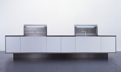
It's this philosophy that inspires Norbert Wangen. His K12 Kitchen designed for BOFFI, Italy's oldest kitchen manufacturer epitomizes it. It represents the best of both  engineering and design. Its sleek, modern and minimal -- clean. Yet it is equipped with a range of technical marvels, including a mechanized opening system in the technical zone of the kitchen which reveals the working areas only when in use. 


True design is always in the details and, although sculpturally minimalistic, Wangen’s designs have a unique playful streak which is classic, utilitarian and beautiful. One might see the same features in this minimalist house. 


It makes sense that we see similarites between such contemporary architecture and Wangen's designs. By training, he is an Architect. He also trained as a carpenter, sculptor, studied Philosophy and did set design for theaters. It was at Boffi, which he joined in 2003, that his wide range of influences came together, providing solutions which are a synthesis of all these aspects. During an interview with WALLPAPER magazine when asked how BOFFI came into the equation he responded 'Well as they say in Britian, if you can't beat them join them.'


Boffi put Wangen's K2 mono block into production in 2004. For it, he was awarded the best domestic design by WALLPAPER magazine and in 2005 he was awarded Product Designer of the year. This kitchen enhances the space in which it exists, with a retractable top concealing the work space when closed and providing a table top when open. The K2 is an efficient and adaptable kitchen that works both functionally and aesthetically. Sticking with the car metaphor, here is a similarly ingenious use of a hidden space and retractable top.


German born Wangen noted that Italians are incredibly sensitive to things like proportion and materials, color and quality while German’s tend to be really rational with emphasis on the technical side. He blends these two seamlessly,using his German sense of engineering and utility with Boffi's Italian style and aesthetics, stirring up the design world ever since.


In 2007, Norbert Wangen's K14 was launched. Characterized by the beveled cut on the worktop and cabinetry doors, enabling a handle-less opening. It was developed for a larger space broadening it's outreach.


Like the K14, the Gama Issa house has a seamless relationship with its surroundings.


When we surround ourselves with pretty things, we feel alive inside. It gives us purpose--like a great love affair. Boffi is at the forefront of understanding this relationship which is why they collaborate and celebrate their partnerships, always leading and setting new standards of design style and excellence.


Wednesday, August 28, 2013

Shedding New Light on Soft Architecture


APERTURE

 A crevice or rupture may be perceived as a severe imperfection in need of repair, as jagged edges and unpredictable angles often suggest sudden and undesirable friction.  Flos's 'Wall Rupture' may be the antidote for this notion.  Designer, Thierry Dreyfus instead highlights the "break" with LED lighting luring your attention and drawing you in.


 above | photography by Riaad Algarei


above | Flos "Wall Rupture' commercial installation | Designer: Thierry Dreyfus | Light Source: LED 


above | Flos "Wall Rupture' | Designer: Thierry Dreyfus | Light Source: LED 


above left | Glas Italia 'Trim' Tables


INTERTWINED

In order for living and even non-living things to be effective they must relate to one another and connect.  Ron Gilad has hit the mark with his demonstration of connecting and interrelated elements.  The 'Wall Piercings' from Flos illustrate the interaction and dynamic relationship between architecture, lighting and the latest LED technology.  With individual rings interlacing, these simple forms take on a whole new life.

above | Photomicrography by William Mark

above | Flos 'Wall Piercings' | Designer: Ron Gilad | Light Source: LED


top | Kartell 'Masters' Chair
middle | Living Divani 'Bolle' Table
bottom | Paola Lenti 'Spun' Rug


A SPROUTED CEILING


As a young boy, Marcel Wanders would stare at the ornamental molding on his bedroom ceiling and conjure up ways of creating a magical reality that may only live in dreams.  That magical reality came to fruition cleverly disguised as a lighting concept in collaboration with Flos.  The 'Skygarden' is available as an integrated recessed fixture or a bold suspension lamp.


above | Flos 'Skygarden' Recessed | Designer: Marcel Wanders | Light Source: Halogen

    top | Flos 'Skygarden' Pendant | Designer: Marcel Wanders | Light Source: Halogen
   bottom left | Moroso 'Fergana' Tables
  bottom right | Moroso 'Hello Lovely' Mirror


SOLAR LED ECLIPSE


A solar eclipse is a beautiful and rare occasion, yet it is not advisable to fixate your stare.  The carefully designed   'G-O' from Flos will delicately light your path without distracting your attention or burning your retinas. Suitable for indoor and outdoor applications. 

above | Flos 'G-O' | Designer: Jorge Herrera | Light Source: LED


second from top | Living Divani 'Tube' Table
 bottom | Glas Italia 'Round' Tables


MOONSHINE


The moon is magnetic; a loyal nightly backdrop for our multi-faceted lifestyles and relationships. Flos has struck a cord by introducing the USO Cove.  The soft inset glow of the Cove, applicable to the wall or ceiling, will leave you moonstruck.


above | 'Moonwalk' filmed by Bryan Smith

 Earth's moon can be generously shared by all, but wouldn't you love to have one all to yourself?


 above | 'Private Moon' by Leonid Tishkov and Boris Bendikov

above | Flos USO Cove | Designer: Flos | Light Source: LED

above | Flos USO Cove - commercial application | Designer: Flos | Light Source: LED

above | Flos USO Cove 


above left | Paola Lenti 'Zoe' Rug
above right | Paola Lenti 'Shell' Pouf


ILLUMINATE


With ingenuity, quality materials and low environmental impact Flos has introduced a brand-new approach to lighting our environments.  Flos's soft architecture demonstrates the powerful relationships between innovative technology and architecture with extraordinary possibilities.  Take the plunge and light up your world.  The future is bright.


above | 'Alternative Landscapes' photography series by Benoit Paille


By Nicolyn Alarcon